

Most people in logistics know about Pareto charts and ABC analysis. Some people in logistics know how to read a Pareto chart and how to derive conclusions for the planning of a logistics system (automated or manual). Very few people, however, including most senior planning engineers, know how to compare different Pareto charts and how to characterize their shape in any precise way. It does not seem to be common knowledge among logistics professionals. Also, if you google it, you are unlikely to get useful results. So, let’s fill that gap.
This article offers just a brief overview of one key detail involved in performing an ABC analysis. For a comprehensive understanding, explore our eBook Understanding ABC Analysis for Warehouse Design Decisions!
What are Pareto Charts and ABC Analyses?
Pareto charts are often used to visualize the results of an ABC analysis. ABC analysis is one of the most essential analyses in logistics. Generally speaking, the ABC analysis is nothing but a prioritization mechanism, and you can apply it to a broad array of different problems to separate the chaff from the wheat. We conduct ABC analyses on orderlines to understand the frequency of access to different products (e.g., as part of designing fast-mover areas or to identify products that you want to take out of an automated system during peak times). We conduct ABC analysis on picking errors to understand if there are certain products that are more prone to picking errors than others, so that we can do something about it (e.g., add more specific picking instructions). We conduct ABC analysis on revenue made with customers so we understand better which customers to prioritize and which to abandon. It is always the same kind of analysis and it is very common.
One of the results of an ABC analysis typically is a Pareto chart. If you hire logistics consultants to do a data analysis, it is almost certain their slides will contain a Pareto chart. Very often, though, the only comment you will hear when the slide appears on the screen is something along the lines of “it looks normal” or “it looks a bit flat”. Which is not so helpful and certainly not precise.
Why is it Useful to Understand the Shape of a Pareto curve?
This is useful, for instance, if you quickly want to understand how well a particular type of storage technology or a concept (e.g., AutoStore or other multi-deep storage concepts) fits the requirements of the warehouse that you are planning.
Here are some examples:
- With a steep Pareto distribution of orderlines, it often makes sense to think about a manual fast-mover area and/or to ease the load on the automation equipment.
- With a steep Pareto distribution of quantities and an order structure that supports it, it can make sense to establish parallel bulk picking and single picking areas for certain products.
- If you want to get a quote for an AutoStore system, the sales consultant will ask you if your Pareto distribution is flat, normal, or steep since this influences the number of robots you will need to achieve the retrieval performance of bins you want.
- The slope of a Pareto curve will influence picker productivity in a manual warehouse.
- A flat Pareto curve might call for another storage strategy (e.g., chaotic storage) than a steep Pareto curve (e.g., ABC zoning).
- If the shape of your Pareto curve changes over time, your AutoStore might cease to deliver the performance you are expecting. In fact, if you are running AutoStore, you should closely monitor your Pareto distribution and how it develops over time. The curve will change in response to the products you are storing and to seasonal changes in demand, which can render your robots more or less efficient. Have you ever wondered why your AutoStore system works well during some times of the year but is too slow during other times? Well, that’s why.
So, the shape of the Pareto curve has huge economic ramifications, and therefore it is important that you are able to tell apart a steep curve from a flat one.
Interpreting the Pareto Chart by Looking at it (“Eyeballing”)
When you look at a Pareto chart, you can get a feeling as to whether the curve is steep or flat. This feeling may mislead you, however: Whether a curve looks steep or flat depends a lot on the ratio of the figure, and thus sometimes even on the screen: if I generate a Pareto chart with Python and Plotly in Visual Studio Code on my 32-in screen, almost every chart looks kind of flat. When I generate the same chart on my 14-in laptop screen, it will look steeper. Because the image is stretched out horizontally a bit more on my larger screen with a different ratio of width to height, it can create the appearance of being flatter. Have a look at Fig. 1, 2, and 3 to get an impression. It shows the Pareto chart of orderlines at an online retailer and all figures are based on the same set of data. The two upper charts were generated on my 14-in laptop screen, the third chart was generated on my 32-in external screen.


This is not a problem that is unique to me or related to Python or Plotly: If you create charts in MS Excel, you can easily stretch them out or compress them and their appearance will change just the same way. In fact, if you use Excel charts in presentations, PowerPoint might do the stretching or compressing for you to make the chart fit a frame, so the result and its effect on the viewer is even less predictable.
Now that we have established that eyeballing a Pareto chart is a highly unreliable way of interpreting it, let’s talk about alternative ways to get a precise interpretation of your ABC analysis.
The Details: Looking at the Actual Data
A precise way of understanding the results of an ABC analysis better is to look at the actual data. The outcome of an ABC analysis is a table of data, grouped by the element of interest (e.g., product ID, customer ID…) combined with an aggregation function (sum, count…). Fig. 4 shows the results of an ABC analysis on orderlines.

Please note the table in Fig. 4 is shortened for the sake of brevity (it contains > 21.065 lines, representing the 21.065 different products sold during the observation period). The column “OL Share cum.” contains the data which when plotted gives you the typical Pareto shape (the blue line in the charts in Fig. 1, 2, and 3 is based on this very data set).
Now, if you have such a table (the full table, that is), you can look for certain markers that allow you to understand the shape of the curve. Pareto charts and ABC analysis are often associated with the “80/20” rule which holds that 80% of the effect of interest is caused by 20% of the population. In our orderline example, it would mean that 80% of the total orderlines picked comes from 20% of the products. In the data and charts shown above, the ratio actually is 80/13, meaning that 13% of the products in the system cause 80% of the orderlines. So, this curve is clearly steeper than normal. To get this value, you go down in column “OL Share cum.” which contains the cumulated share of orderlines until you hit 0.8 and you look for the corresponding value in column “SKU Share cum.” which contains the cumulated share of SKUs. Alternatively, you may want to start with the column with cumulated share of SKUs (“ SKU Share cum.”) and look at the 1%, 5%, 10%, 20%, 30%… markers and the corresponding values in the column with cumulated share of orderlines (“OL Share cum.”), or you go through the column with the absolute number of SKUs („SKU Count cum.„). It certainly makes sense to let your tool (whatever you use) generate a table with those markers automatically. This could look like in Fig. 5. where I’m listing a absolute numbers of SKUs and their corresponding cumulated shares in terms of SKU count and orderlines.
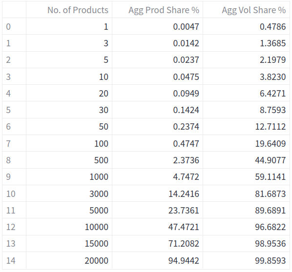
The table in Fig. 5 allows you to easily grasp essential findings from the ABC analysis. You can see that the top 100 products (out of 21.065) represent almost 20% of all orderlines. This would be a good case for a manual fast-mover area. Put differently: if you included the top 100 products in your AS/RS for goods-to-person picking, you need to build a system that is 20% more powerful and thus significantly more expensive than if you had those products in a separate manual area. The top 3.000 products, representing about 14% of all products, produce slightly more than 81% of all orderlines.
Please note there is an error in here already: Because the set of order data analyzed contains only those products that were ordered at least once, all the products that were not ordered at all during the observation period are not included! This means the actual, more precise Pareto distribution is even steeper, but we can only do the more precise analysis if we have access to the inventory data, too, and not only the order data. This probably is the most common error in ABC analyses. Next time your logistics consultant presents you a Pareto chart, point this out as a segue to renegotiate his daily rates.
Alternatively, it could look like in Fig. 6 where based on cumulated SKU shares the corresponding cumulated share of orderlines is looked up and presented. (The logic is similar to a Vlookup or Xlookup in MS Excel).

Please note that because you often do not have a cumulated SKU share of, say, precisely 15%, you need to look for the closest actual value before you look for the corresponding value in orderlines.
Having such a summary table proves extremely useful for quick system sketches and customer meetings. It should be a standard output for all ABC analyses so they are actually of any use.
The Shortcut: Working with the Gini Coefficient
It would be useful if we had one metric that would tell us immediately if a curve is rather steep, rather flat, or rather standard (80/20), would it not? Fortunately, such a metric exists. In fact, two such metrics exist: one is the shape parameter of the Pareto curve, and the other one is the Gini coefficient. If you want to remind yourself why you decided not to major in mathematics in college, or if you are just seeking ways to make yourself unhappy but you don’t have a Twitter account, go ahead and read about this shape parameter on the Pareto distribution’s Wikipedia page. We will focus on the Gini coefficient, which is much more straightforward and easier to compute.
The Gini coefficient is most commonly used as a statistical measure of economic inequality. It ranges from 0 to 1, with 0 representing (in the example of economic analysis of inequality) perfect equality (where everyone has the same income) and 1 representing perfect inequality (where one person has all the income and everyone else has none). The Gini coefficient is equal to the area between the Lorenz curve and the perfect equality line (the 45 degree line where the proportions are equal) divided by the area under the perfect equality line. What’s the Lorenz curve? It’s very similar to the Pareto curve. The difference is that in order to plot a Pareto curve, you sort all the individual values (e.g., sum of orderlines per product) in descending order before cumulating them whereas for the Lorenz curve, you sort them in ascending order. Fig. 7 shows the Lorenz curve (red) and the perfect equality line (blue) for the same data set as used above for the Pareto charts.

If the Pareto curve of a data set is steep, so is the Lorenz curve – just on the tail end. Accordingly, as we use the Gini coefficient to characterize the slope of the Lorenz curve we gain insight into the slope of the Pareto curve. The Gini coefficient allows us to understand a Pareto distribution at one glance.
For demonstration, I have run an ABC analysis on seven different systems and computed the Gini coefficient. You can see how the steeper looking curves have a larger Gini coefficient. I have included the results seven dynamic charts with Pareto curves from different anonymized projects (different industries, different countries, different continents). In the interest of making the text easier to read, I have added the charts below the conclusion.
In these charts, what you can explore is how different the distributions are in terms of the markers (what percentage of products causes what percentage of orderlines) and how this influences the Gini coefficient. If you look at the Health & Beauty example (from Europe), you can see that it takes 40% of the products in the system to generate 80% of the orderlines (Gini coefficient 0.537). Compare this with the electronics wholesale example (from North America) where the Gini coefficient is 0.848: it takes only 12% of the products to generate 80% of the orderlines. A Gini coefficient of above 0.8 indicates a very steep ABC distribution, a Gini coefficient of 0.5 indicates a very flat ABC distribution (don’t try multi-deep storage systems!). The Mechanical Parts Wholesale system comes with the almost perfect Pareto curve of 80% of orderlines to 22% of SKUs; the Gini coefficient is 0.749.
Please note that the Gini coefficient considers the entire curve, not only individual markers. Curves of different shape can even produce the same Gini coefficient. Hence, it can happen that at the 80% marker of cumulated orderlines a distribution with a higher Gini coefficient may require more SKUs to generate the amount of orderlines. Compare the chart of Automotive Aftermarket with the chart of eGrocery II: in the Automotive Aftermarket system with a Gini coefficient of 0.705, about 25% of products are needed to generate 80% of orderlines, which is the same ratio as for eGrocery II with the slightly higher Gini coefficient of 0.715.
Conclusion
The Gini coefficient is a very handy way of summarizing the results of an ABC analysis and shape of a Pareto curve and, importantly, to keep track of them. Whether you are making decisions about fast-mover areas, storage or picking concepts, or you are trying to understand better your pickers‘ performance, it is necessary that you understand the results of your ABC analysis. Understanding means: not just staring at a chart and trying to figure out if it looks „normal“. For many operational decisions, you will want to look at the resulting data table of your ABC analysis. For tracking the development of your curve or for comparing different curves, the Gini coefficient (or its less pretty cousin, the shape parameter) will do the job.
Are you a warehouse automation provider or a logistics service provider and you want to train your staff in data analysis of logistics systems? Get in touch for a quote!
Appendix
Below you find Pareto charts based on anonymized data from seven different warehouses. You can move the cursor along the curve to see the values of cumulative share of products and cumulative orderlines.
Technical Note
The shape parameter of a „classical“ Pareto curve is 1.5. This translates into a Gini coefficient of 0.64. The formular to compute the Gini coefficient from the shape parameter is Gini = 1 – 2 / k. However, for most projects I look at, the Gini coefficient of a curve close to the archetypical Pareto curve (80/20), at least as far as orderlines are concerned, is somewhere between 0.73 and 0.76, which translates into a shape parameter of around 7.7 to 7.9. I will be happy to hear from you if your experience is different or if you can confirm this observation.


